
Spring 2016
PRINT COMPETITION WINNERS
Illustrative / Landscape Category
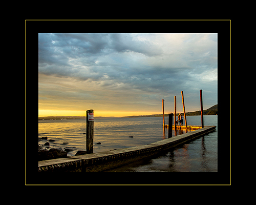
Best in Show: “Our Special Place” – by Maureen Moore

Judges Comments:
Very, Very, VERY nicely done! There’s a nice ‘Leading Line’ coming in from the left, and Mother Nature has lit the couple perfectly for this image. Crop out / clone out the sign on the first post – it’s distracting – not needed. The inside black border should be thinner, and the thin line should be a warm sunrise tone . . . NOT bright yellow.
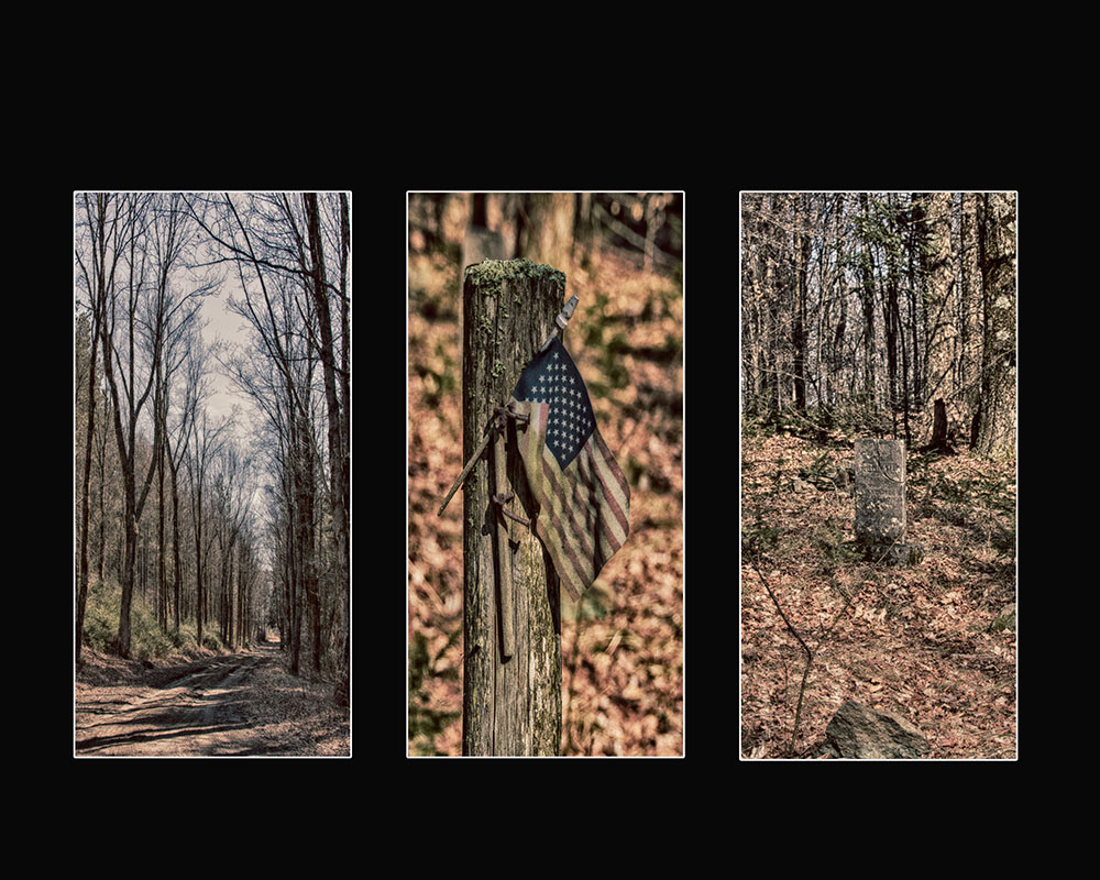
First Place: “Remember” – by Janet Snyder

Judges comments:
“When an Image doesn’t need a Title to tell the story it has IMPACT”! These three Images tell the whole story – there’s an old dirt road or path, and an old grave site from many years ago on the side of this country road.
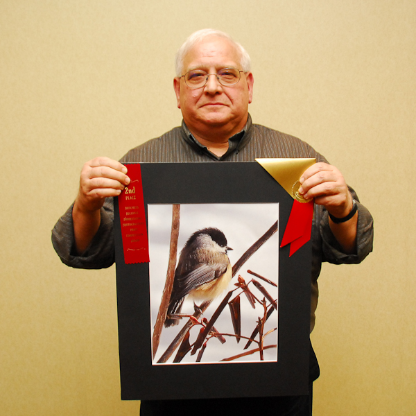
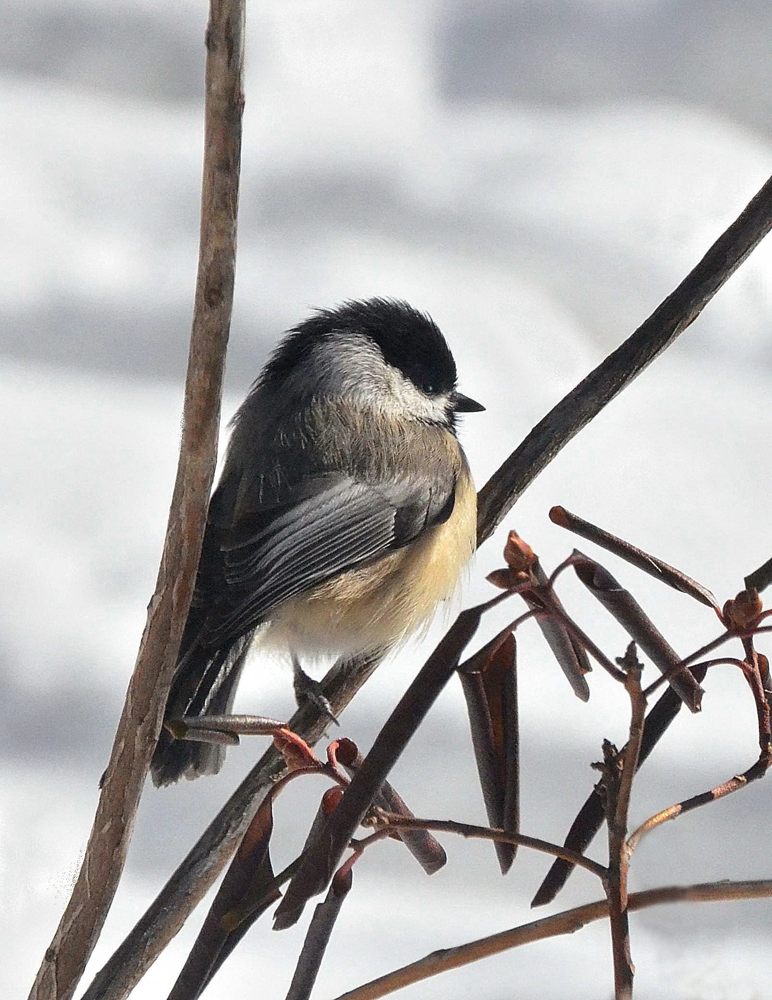
Second Place: “Snowbird” – by Ed Mekeel
Judges Comments:
Very nice sharp image – there are details in the bird’s feathers. The matboard goes very well with the bird’s color. Oftentimes we recommend a Glossy Black Mat around images, BUT this is one of those exceptions – very nice.
Third Place: “Fallen Leaf” – by Dale Leifeste
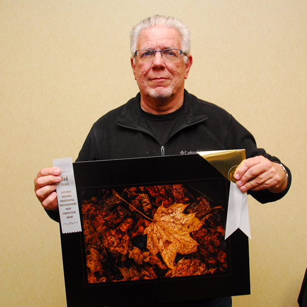
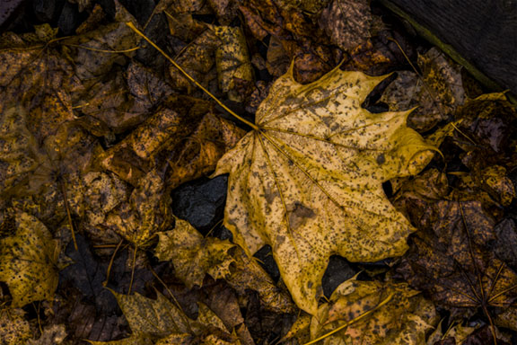
Judges Comments:
The fact that the large leaf is brighter than all of the other leaves in this image makes it have Impact – it’s obviously the ‘Subject’. Clone leaves from the tree branches into the upper right-hand corner to cover the bright sky area – too distracting – shouldn’t have ‘snippets’ like this sky showing.
Portrait Category
Best in Show: “Not sure if the Vagabond Life is right for me” – by Sheila Bogart
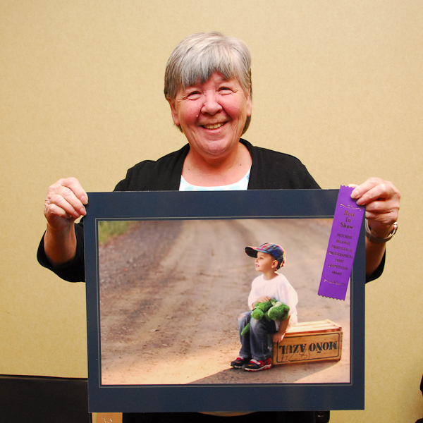
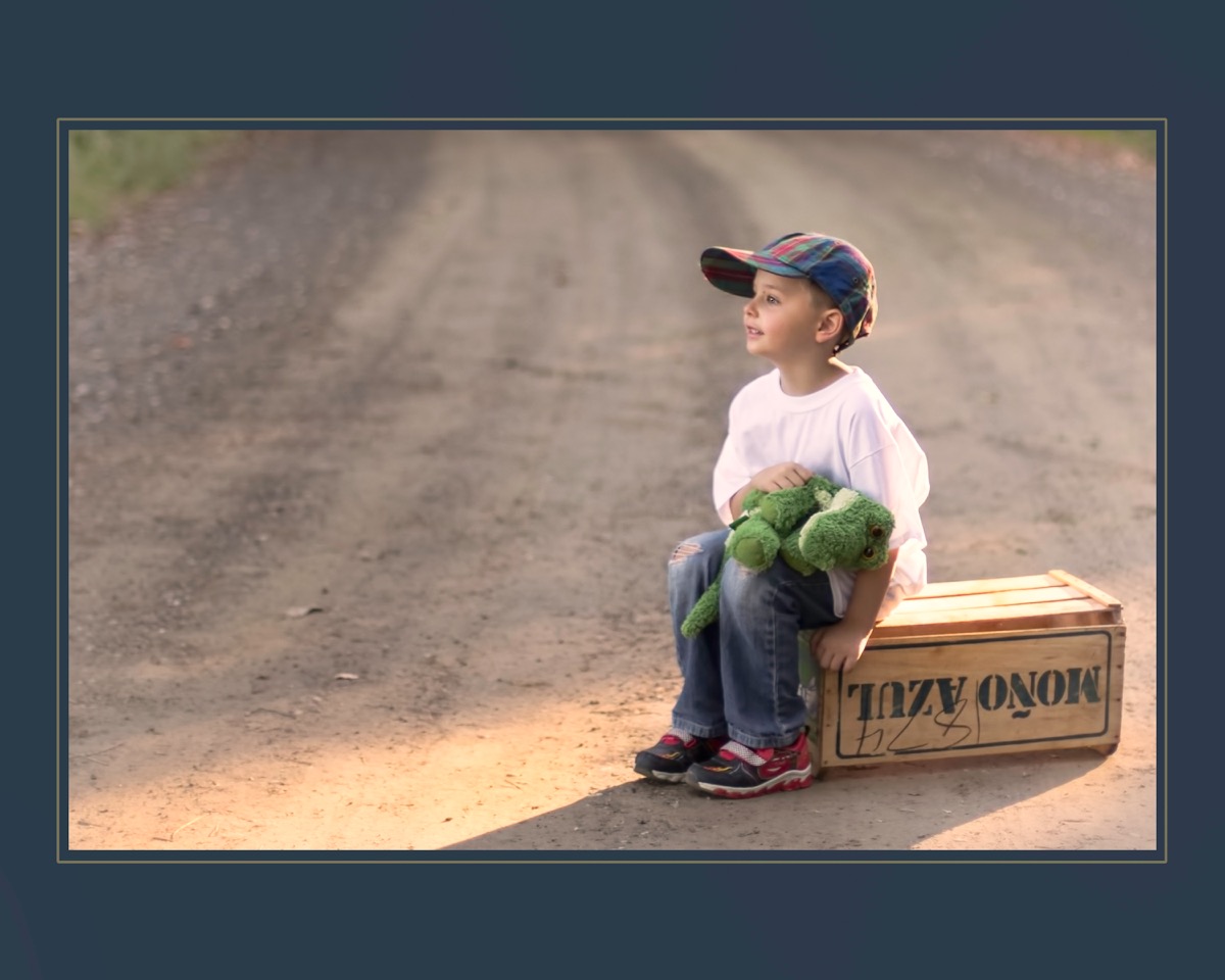
Great story-telling, with nice ‘Leading Lines’ coming into the Image. The placement of the subject is perfect. However – there is obviously a contradiction in the ‘Direction of Light’. You can’t have light coming from two separate directions.
Judges:
Frank Dispensa and Maureen Gates – April 14, 2016
A special thank you goes out to Maureen for her very insightful judging and critiques.