Spring, 2015
Print Competition Winners
We were pleased to have quite a large variety of prints for this competition. This is the first time we had a separate category for Portrait Prints. Our Print Competition Judges Frank Dispensa and Joe Brady gave constructive critique comments for each image in the competition, and awarded ribbons to to the four best prints in the “Illustrative” and “Portrait” categories.
Best in Show-Illustrative
“Urban Dreams”
by Wendy Spierling
Judges Comments: “Urban Dreams” – Excellent combination of a Print and a Title! Well Done. Mat should be Glossy Black.
First Place-Illustrative
“You Are Not Alone”
Judges Comments: – You Are Not Alone -Gorgeous Print, composition is very beautiful. Nice balance with the “Rule of Thirds”. The dark tree on the right keeps the viewer in the image.
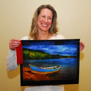
Second Place-Illustrative
“Ready To Launch”
by Sherrie Fryxell
Judges Comments: “Ready to Launch” – The composition is great; treatment is surreal. The sky is in color-coordination with the water. Clone out the two rocks in the background – they’re distracting.
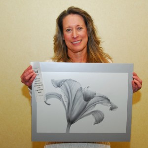
Third Place-Illustrative
“Sheer Delight”
by Sherrie Fryxell
Judges Comments: “Shear Delight” – I love the texture & matting. Need more of the flower’s stem in the picture, and make it more-diagonal. Black Glossy Mat would look better.
Best in Show-Portrait
“Little Miss Prissy”

Judges Comments:“Little Miss Prissy” – Great color harmony. Wonderful composition. Background lighting is beautiful. The balance between the flower and the dog offset each other.
First Place-Portrait
“Yesterday Once More”
Judges Comments: “Yesterday Once More” – Beautiful portrait; Exposure is great. The lighting is great; the Teddy Bear is a nice diagonal line. It would be better if the girl was a little to her left so that she’s not directly behind the carriage.
Second Place-Portrait
“The Eyes Have It”
by Don Smith
Judges Comments: “The Eyes Have It” – Great “Impact”! Looks like “The Walking Dead”. There’s no direction of light – a portrait image needs some shadow on the face. Girl’s hair on the left is too bright.
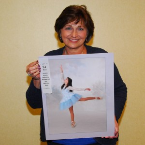
Third Place-Portrait
“On Her Toes”
by Theresa Terilli
Judges Comments: “On Her Toes” – Great profile! I like the treatment. A horizontal photo would be a better image – the girl needs more room in front of her.


